Spring UX Internship
Designing the Brand and UX for a new audio show app.
UX DESIGN

UI DESIGN
GRAPHIC DESIGN

During this internship, I contributed to a wide range of design tasks, from polishing UI on key account pages to crafting launch graphics for the company’s brand-new mobile app. Some projects involved quick design tweaks, while others required full ownership—from ideation and iteration to high-fidelity execution
Before jumping into the Account Settings page, I made smaller visual updates to a few other parts of the site as part of Bridgecrest’s full redesign. Account Settings was the first page I fully owned—redesigning it from the ground up using the new design system to create a cleaner, more intuitive experience.


For the Manage Debit Cards page, I worked together with another designer who was working on the Manage Bank Account Screens. Together we made sure the new design was consistent between both pages.


One tricky challenge I tackled was reworking a tooltip on the payment screens. Originally, when users hovered over part of the payment amount, a pop-up would appear showing a breakdown. But hover interactions don’t work on mobile—and even on desktop, the tooltip wasn’t essential. I was tasked with removing it entirely and adjusting the designs for both desktop and mobile to keep everything clean and intuitive.


While updating several web pages, I needed to create custom icons that matched the new Bridgecrest design system. I kept them clean and minimal to align with the updated visual style, ensuring consistency across the redesigned site.

Before the app officially launched, I designed two teaser graphics for Bridgecrest’s internal social media platform:


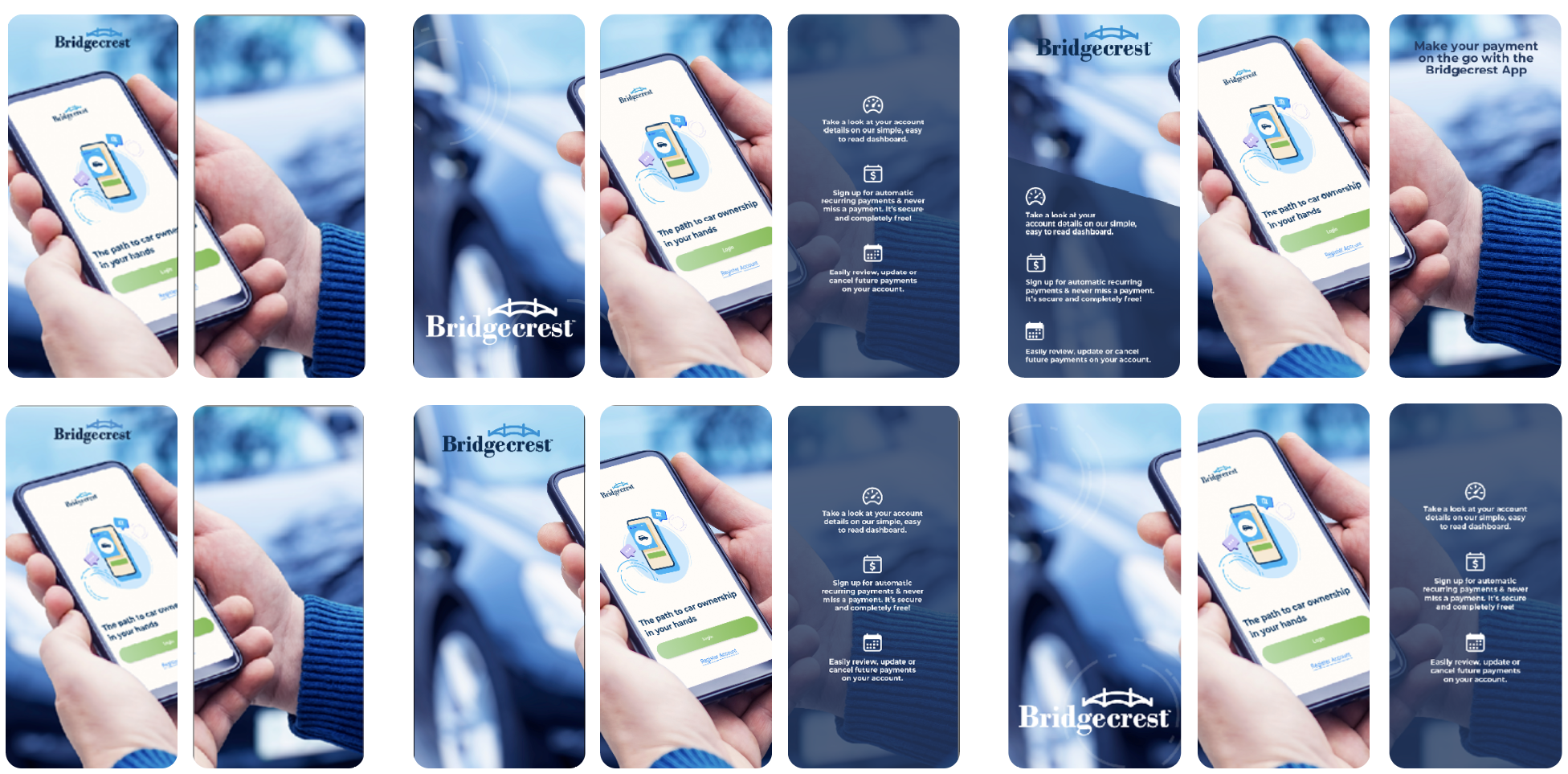
One of my favorite projects during the internship was designing the app preview images for the Apple App Store and Google Play Store.
Since this app isn’t something people download casually (only Bridgecrest customers need it), I aimed for a simple, professional look that emphasized clarity over flash.

To announce the public launch of the app, I helped design a four-post social media campaign for Twitter and Facebook. I worked closely with the UX writer again to pair strong, clear copy with eye-catching visuals that matched the app store imagery for brand consistency.


I also designed an Open Graph image to appear when people shared the app link online.

One of my last design tasks at Bridgecrest was creating a persona template for the UX team. The goal was to make presentations with stakeholders more engaging and easy to understand. For this designed a clean, structured template that highlighted key user information at a glance while.
